< Previous Article Next Article >
Commonly Used Widgets
Here are some commonly used Rich Display widgets:
- Labels and Headings
- Buttons and Hyperlinks
- Dynamic Output Fields
- Tab Panels and Accordions
- Textboxes and Text Areas
- Spinners
- Date Fields
- Dropdowns and Combo Boxes
- Checkboxes
- Radio Buttons
- Images
- Icons
- Grids
- Charts and Maps
- Panels
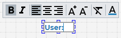
Labels and Headings
Labels and headings are unbound output widgets meant to display static information.
In the Visual Designer, you can double-click a label or heading to use inline editing to modify the widget text.
Buttons and Hyperlinks
There are several types of button and hyperlink widgets available in the Visual Designer. You can-double click the widget to change its text.
To specify an action for the widget, use the onclick event to either provide either low-code business logic or client-side JavaScript logic.
To pass control directly to a stateful Node.js application when a button or hyperlink is clicked, bind the response property.
Buttons also have an icon property that you can specify.
Dynamic Output Fields
Dynamic output fields display dynamic data provided by your low-code routines or your JavaScript code.
Double-click the widget to specify binding information, such as field name, data type, and formatting. This action binds the value property on the widget.
If the field is coming from a database table, consider using the Database tab as a quick way to add the field to your screen.
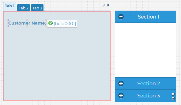
Tab Panels and Accordions
These widgets allow you to organize content into different sections. Once the desired section is selected, you can drag other widgets into that section.
Relevant properties for these widgets include:
tab names/section names- specifies tab/section names; however, you can also double-click a tab heading in the Designer to change its nameactive tab/active section- specifies the tab or section that is initially selected when a screen or component is renderedtab response- sends a response to the server when a tab is clickedontabclick/onsectionclick- allows you to provide custom logic when a tab or accordion section is clicked
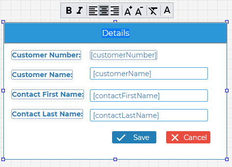
Textboxes and Text Areas
A textbox or a text area allows the user to type in text. Double-click the widget to bind it to the appropriate field in your application. This modifies the widget's value property.
The input type property can be used to specify the type of information expected from the user (number, date, telephone, etc.)
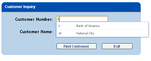
Textbox auto-complete
Textboxes can provide auto-complete capabilities from a set of choices.
Auto-complete choices can be connected directly to a database table without writing any code. This is done by setting the widget's Database-Driven Auto-Complete properties.
Client-side validation
Input widgets like the textbox have a variety of built-in client-side validation properties. For example, by setting the required property, we can automatically force the user to enter data into a textbox without having to write any additional code.
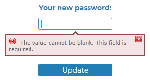
Other client-side validation properties include valid values, comparison operator, comparison value, range low, range high, validate email, and allow blanks.
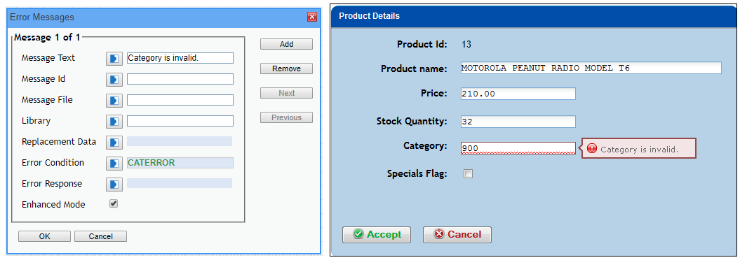
Server-side validation
If your validation routine requires complex logic or server-side access (e.g. working with a database), you can set the error messages property. A Boolean field can then be used to trigger a validation error message.
Spinners
The spinner widget is an input widget used for numeric input. Users can change the value using the up/down arrows, or users can set the value by typing it.
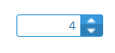
You can specify the min value, max value, and the increment value properties to control how the effect of the up/down arrows.
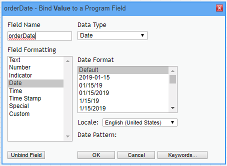
Date Fields
Date fields are textboxes with an associated date picker.
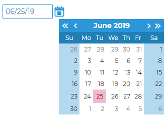
Double-click the widget to bind the date field to a JavaScript value. In the Binding Dialog, you can specify a date format.
Dropdowns and Combo Boxes
Dropdowns and combo boxes allow users to select a value from a list. Combo boxes also allow the user to type a value manually.
You can double-click the widget to bind its value property to a JavaScript variable.
Secondly, you can use one of the following property categories to populate the selection list:
- Selection Choices - the list of choices is either hard-coded or comes from dynamically bound variables
- Database-Driven Selection - the list of choices comes from a database table
- Dynamic Selection - the list of choices is fetched from a REST web service
Checkboxes
Checkboxes allow the user to make a binary choice. You can bind the value property of a checkbox to a dynamic field. You can also specify the checked value and the unchecked value properties to control what goes into the field.
The label property determines the label that is shown next to the checkbox.
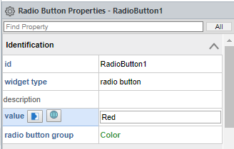
Radio Buttons
Radio buttons come in groups. Only one radio button within a group can be selected, or checked, at any one time. To create a radio button group, drag several radio button widgets onto the canvas. Then, bind their radio button group properties to the same field. A quick way to do this is to drag your mouse over the radio buttons to select them all at the same time.
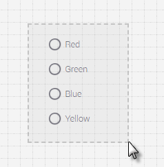
This will allow you to use the Properties Window to modify the radio button group property on all the elements within the current selection.
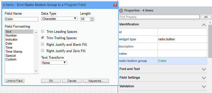
Next, for each radio button, specify the value property. The value will be placed into the field bound to the radio button group property, if that radio button is selected by the user at runtime. There is no need to bind the value property.
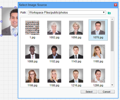
Images
Once you place an image widget on the canvas, you can double-click it to set the image source property.
Your workspace images should be placed in the public directory in order to properly render.
If you'd like to render a dynamic image, find the image source property in the Properties Window and click the binding icon.
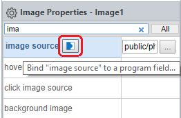
You can use the onclick property to specify what should happen when the image is clicked.
Icons
Once you place an icon widget on the canvas, you can double-click it to select an icon from an icon font. This sets the icon property.
Icons are resizable and you can also change the icon color using the color property.
You can use the onclick property to specify what should happen when the icon is clicked.
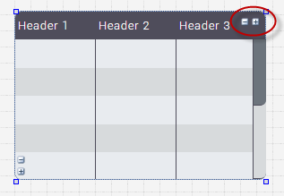
Grids
The Rich Display grid arranges your data into rows and columns, similar to an HTML table. However, in Rich Displays, grids have many built-in capabilities, such as sorting, filtering, row selection, and more.
Adding grid columns
You can add or remove columns by using the plus and minus icons on the right side of the grid.
Sizing rows and columns
You can resize columns by dragging the column's vertical border from side to side.
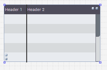
Similarly, you can expand the size of the rows by dragging the horizontal border.
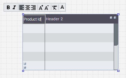
Setting grid headings
Double-click into each column’s heading to modify the heading text and formatting.
If your grid does not need headings, set the has header property to false, or right-click the heading and select Remove Header.
Adding fields
To add fields to the grid, drag and drop other widgets into the first row of the grid.
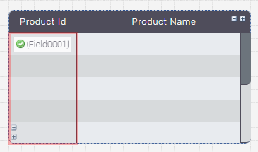
The appropriate column will be highlighted right before you drop the element. Once the element is dropped, it will repeat to all rows within the grid.
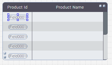
Any bound property or widget within the grid can now be loaded with dynamic data from your application logic.
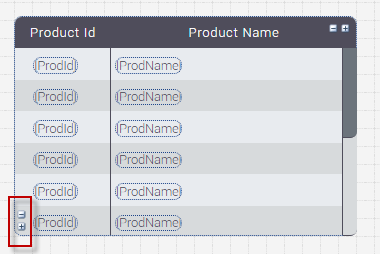
Setting number of visible rows
You can add or remove visible rows by selecting the plus and minus icons at the bottom of the grid.
Enabling grid features
Use the Properties Window to enable various grid features. For example:
row selectionresizable columnsmovable columnssortable columnsfind optionfilter optionxlsx exportallow drag
Grid styling
Grid components can be styled using CSS. You can assign the grid's css class property in order to implement your own styling. Profound.js Spaces already ships with a number of grids you can choose from that are styled in different ways.
Charts and Maps
Rich Displays offer multiple ways to visualize data through charts and maps. You can find basic chart widgets under the All Widgets tab. Once a chart widget is placed on the canvas, you can customize it as necessary. Use the chart type or map type property to identify the type of chart or map you'd like to render.
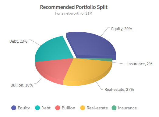
Single-series charts
Single-series charts include Column, Bar, Pie, and Line charts over one dataset. Single-series charts can be loaded directly from a database without writing any code by setting the Database-Driven Chart properties. They can also be loaded from a simple list of names and values simply by populating those properties.
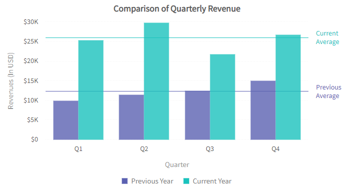
Multi-series Charts
A multi-series chart is used to visualize relationships between multiple datasets. The data for these charts can be provided by populating one of the properties in the Dynamic Chart category.
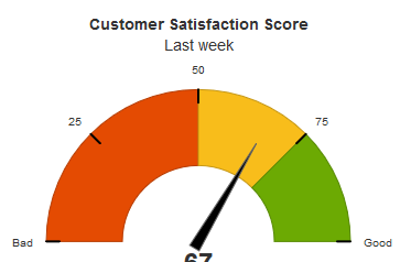
Gauges
This type of chart widget can render various types of gauges. Depending on your application, a gauge can be more meaningful than a traditional chart.
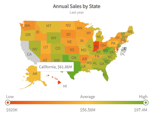
Maps
A map is an interactive widget that displays numeric data with geographic locations.
First, set the appropriate map type, for example "world", "usa", "europe", or "map/ohio". There are over 1000 map types available.
You can also set the chart options property to adjust how the map is displayed.
The map data can be loaded using either properties in the Database-Driven Chart category, or by specifying XML or JSON data in the Dynamic Chart properties.
Panels
A panel is an element used to visually group a set of widgets together. You can drag other widgets directly into the panel.
You can change a panel's heading just by double-clicking it. You can change a panel's look and feel by using CSS, although a number of different panel styles are already provided on Profound.js Spaces.
To center a panel with its container, right-click it and select Center Horizontally and/or Center Vertically.
To have the panel come up as a popup window, use either the Window properties or the Transition Animation properties at the screen level.
Questions?
Have questions about this topic? Ask for help on our Profound.js Spaces Discussion Forum.